
Trends come and go, but a handful of layout patterns keep earning their place in nearly every product and marketing site we ship. Here are the five we reach for most.
1. The split hero
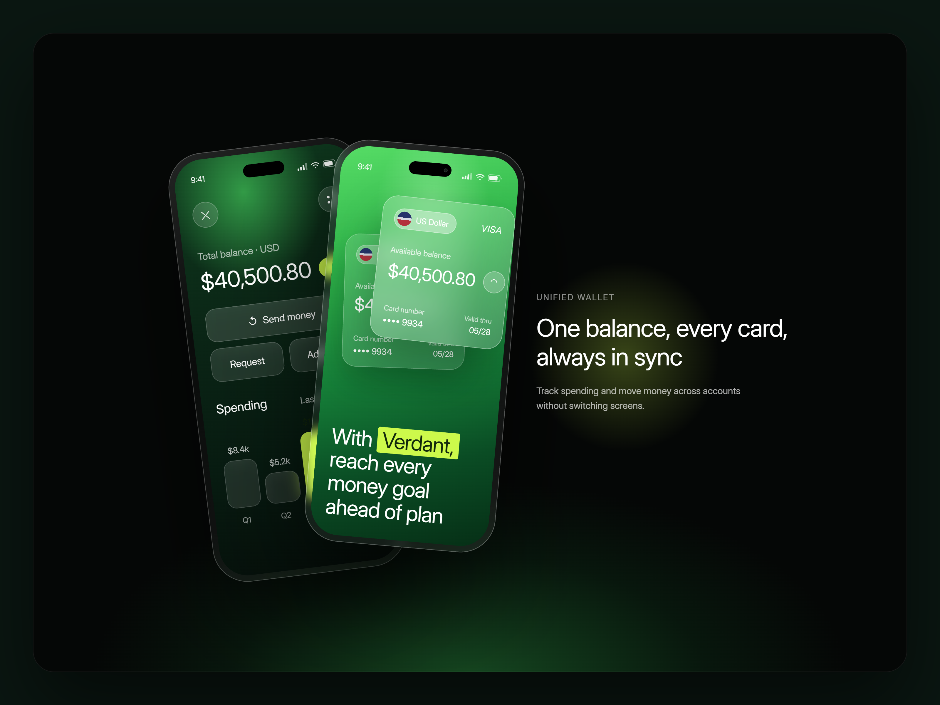
Headline and proof on one side, product or imagery on the other. It lets copy do the persuading while the visual does the showing — neither has to carry the whole page alone.
2. The bordered bento grid
Stat cards and feature tiles inside a single hairline-bordered container read as one cohesive system rather than a scattered list — and it scales cleanly from three items to eight.
"Good layout is invisible. You only notice the ones that fight you."
3. The peekaboo carousel
Showing a sliver of the next and previous card (instead of hiding them entirely) gives users a spatial sense of "there's more here" without needing arrows or dots to explain it.

Table of contents
1. The split hero2. The bordered bento grid3. The peekaboo carousel
MoreFrom the blog