Building a unified finance experience for Nuvik Pay
Nuvik Pay needed a fintech product that felt as trustworthy as a bank but as fast as a modern app. We rebuilt their core dashboard, streamlined the payments flow, and introduced a live fraud-scan feature that resolves flags in under two seconds.
Nuvik Pay came to us managing payments, records and fraud alerts across disconnected tools.
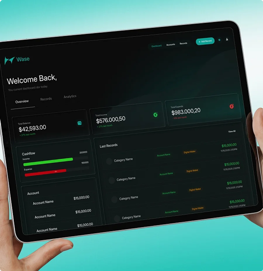
Most fintech dashboards focus on isolated tasks like reconciliation or alerts alone. We approached it differently by building a unified operational system where the team can manage accounts, transactions, risk signals and reporting from one centralized environment.
The project was built around three core goals:
The Challenge
Most fintech dashboards feel fragmented — payments, reconciliation and fraud flags scattered across tabs. Nuvik Pay needed a system that centralized all three without slowing anyone down.
Solution
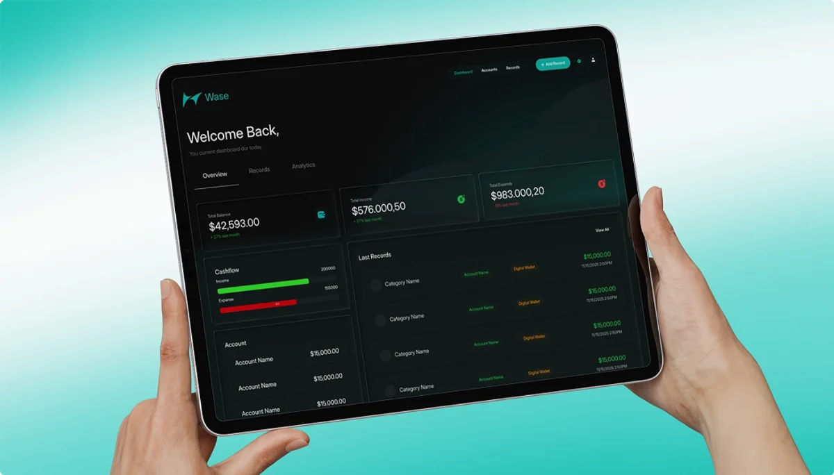
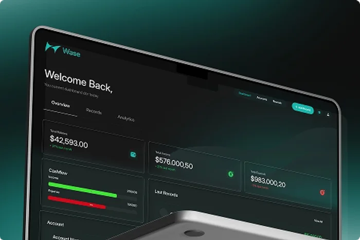
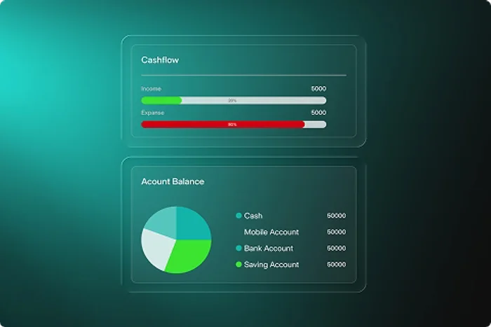
We designed a modular dashboard where cashflow, accounts and live fraud-scan results live in one connected view, styled around a calm teal-on-dark system built for daily use, not just demos.
Most people don't lack tools — they lack clarity.
Financial data feels scattered
Payments, reconciliation and risk flags lived in separate tools, making daily oversight slower than it should be.
More dashboards, more noise
Existing tools buried the signals that mattered under charts nobody checked twice.
Clarity drives faster decisions
A calmer, structured view helps the team catch and resolve issues before they become support tickets.
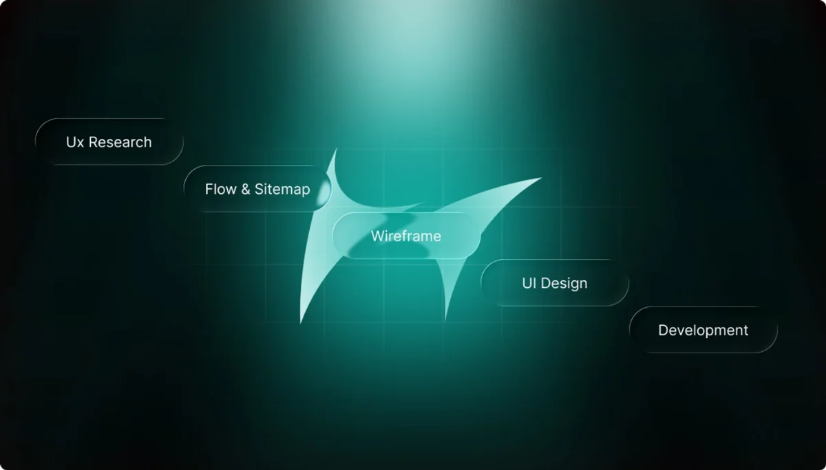
Every engagement follows the same rigor — from technical discovery through to a scalable, shipped platform.
Discovery & strategy
Mapped how the team tracked payments, reconciliation and fraud across their existing tools.
System architecture
Structured the dashboard around accounts, records and live risk signals in one connected view.
UI design & development
Built a responsive interface focused on clarity under pressure — fast to scan, fast to act on.
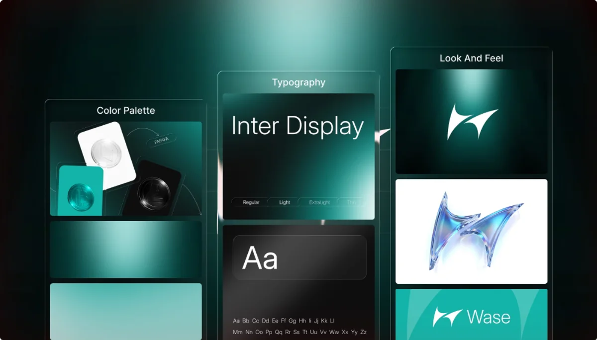
Instead of chasing loud fintech trends, we built a calmer, structured environment: dark surfaces, teal financial accents, and a clear hierarchy for every number on screen.
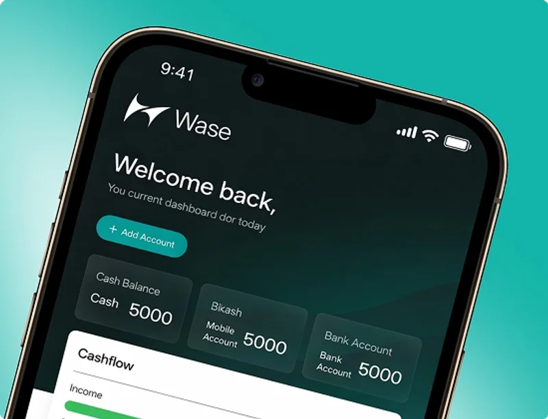
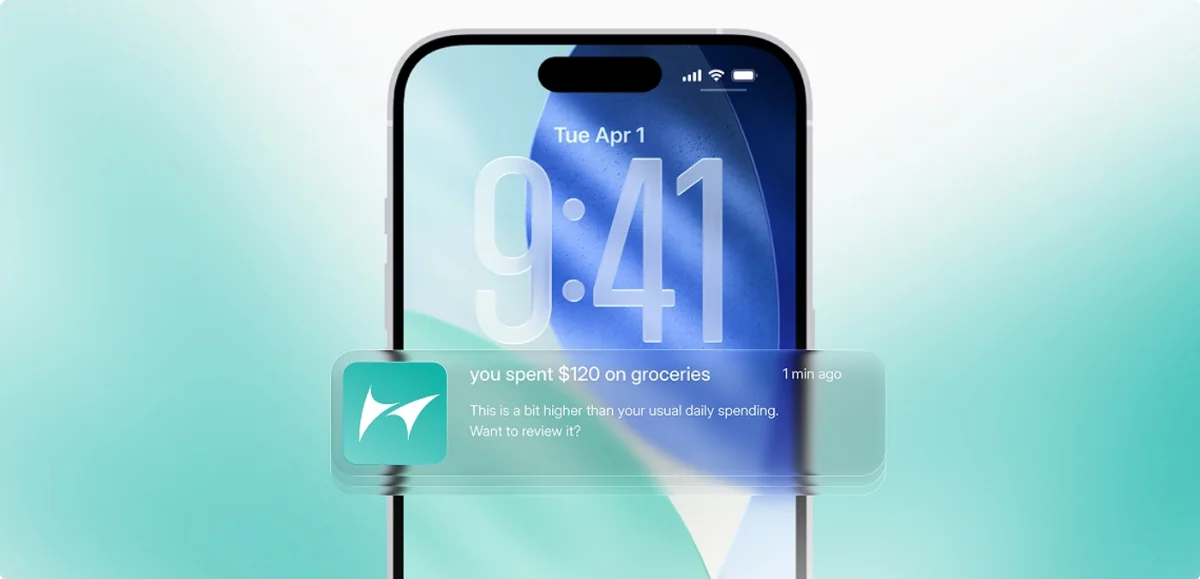
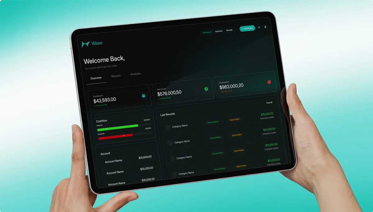

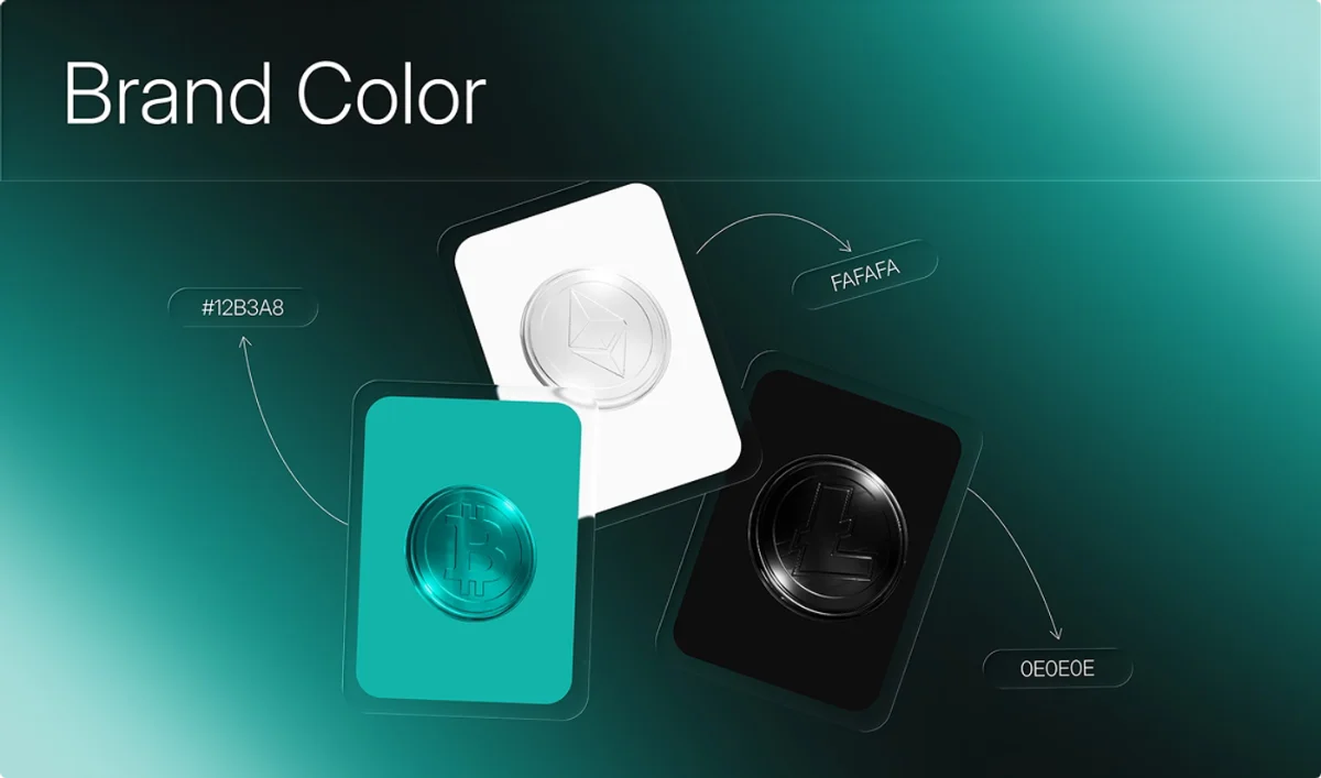
From dashboards to fraud alerts, every screen follows the same teal-accent, dark-foundation system — so the product feels like one connected tool, not five separate features stitched together.
Before working with Brandsquare, our dashboard felt more like a spreadsheet than a product. Their team reshaped the entire experience — the fraud-scan flow alone changed how our support team works.
Aetienne Sardon
Founder, Nuvik Pay